

In this tutorial, you will learn how to use react-select library to create a dropdown selection in your React app. Before that, let’s first understand what React-select is and why should you use this library in your React.js project.
React-select
React-select is an easy to use dropdown library create by Jed Watson and few other awesome contributors. It is a powerful library, offers various features such as multi-select, autocomplete and many more. This is a perfect choice for your next Reactjs project, providing numerous dynamic functionalities to the dropdown components including search and filter functionality, animation, easy accessibility and faster loading time.
Features provided by React-select package include:
- Flexible approach to data with customizable functions.
- It handle large number of dataset.
- Simple customization with API support.
- Controllable state props and modular architecture.
- Manage component state easily.
- CSS styling with emotion support. Provide CSS animation support for components.
- Long-requested features like option groups, portal support, animation, and more
Step 1: Install React and other libraries
Dependencies used for this project.
- React-Select Library
- TailwindCSS for CSS and styling (optional- you can use any styling library)
Run the following command to install a brand new React project. You can either use yarn or npm, but for this tutorial, npx is used. This will create a React app for us.
npx create-react-app react-selectChange the directory and get inside to the project folder. You can always clean the project just a little bit. Remove the files you do not required for this project.
cd react-selectInstall Tailwind CSS
Install TailwindCSS and its peer dependencies via npm, and then run the init command to generate both tailwind.config.jsand postcss.config.js.
npm install -D tailwindcss postcss autoprefixer
npx tailwindcss init -p
Configure your template paths
Add the paths to all of your template files in your tailwind.config.jsfile.
module.exports = {
  content: [
    "./src/**/*.{js,jsx,ts,tsx}",
  ],
  theme: {
    extend: {},
  },
  plugins: [],
}
Add the Tailwind directives to your CSS
Add the @tailwinddirectives for each of Tailwind’s layers to your ./src/index.cssfile.
@tailwind base;
@tailwind components;
@tailwind utilities;
Start using Tailwind in your project
Start using Tailwind’s utility classes to style your content and it will reflects the changes you make to the app.
Install React-Select Library
Now, this is important step. We need to install React-select package. For that simply run the following command.
npm i react-selectOnce it is installed, you can now import the react-select module any where in our project. For simplicity it is imported in src/App.js file.
Now create a function that will handle our selected value. Name it setHandle and call it on the component. It will change the current value once user click to the dropdown.
import "./App.css";
import React, { useState, Component } from "react";
import Select from "react-select";
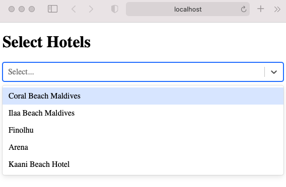
const Hotels = [
{ value: 1, label: "Coral Beach Maldives" },
{ value: 2, label: "Ilaa Beach Maldives" },
{ value: 3, label: "Finolhu" },
{ value: 4, label: "Arena" },
{ value: 5, label: "Kaani Beach Hotel" },
];
function App() {
const [selectedOptions, setSelectedOptions] = useState(null);
const setHandle = (e) => {
setSelectedOptions(Array.isArray(e) ? e.map((hotel) => hotel.label) : []);
};
return (
<div className="mx-auto container py-8">
<h1 className="text-sm">Select Hotels</h1>
<div className="flex flex-wrap items-center lg:justify-between justify-center">
<div className=" px-2 ">
<Select options={Hotels} onChange={setHandle} isMulti />
</div>
<div>{selectedOptions}</div>
</div>
</div>
);
}
export default App;An array named Hotels is created, it then pass the hotel list to the dropdown. Hotel names is displayed when a user clicks on the dropdown and select element with the help of the react-select library.
There are many other properties available and common props you may want to specify include:
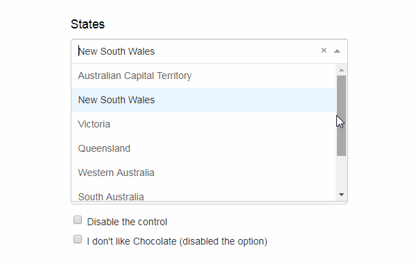
autoFocus– focus the control when it mountsisDisabled– disable the controlisMulti– allow the user to select multiple valuesisSearchable– allow the user to search for matching optionsname– generate an HTML input with this name, containing the current valueonChange– subscribe to change eventsoptions– specify the options the user can select fromplaceholder– change the text displayed when no option is selected
React Multi Select Dropdown
Multi select option is one of the popular properties provided by this library. let us understand how this is used in a React project. It is actually very easy, simply you need to add isMulti prop to select various value in a select dropdown.
<Select options={Hotels} onChange={selHandle} isMulti />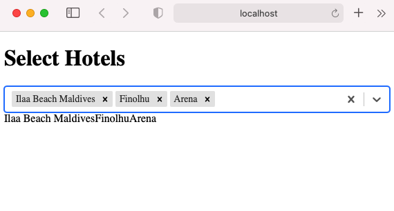
Thats all for now! You can find code for this tutorial in this GitHub repo