Flutter is a powerful choice for web and mobile apps development. In Flutter, we can create a fully responsive designs for several platforms using one code base. As we all know a responsive design ensures the appeal of our application is consistent and gives users a seamless experience, no matter the size of the device. For example, when the screen size of the browser extends to a certain width the layout of the app will be changed.
In this short article, we’ll be covering how to create responsive designs in Flutter for web and mobile devices.
Getting Started
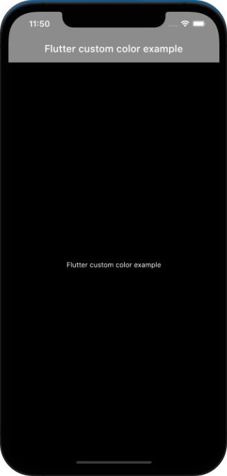
To begin, we’ll simply use the app we created in previous tutorial that looks like something like this👇.
💡 For simplicity we are using fixed numbers for screen resolution but when designing user interfaces for mobile apps, always avoid hardcoding numbers for widget sizes and instead utilize percentages. The MediaQuery class in Flutter may be used to do this.
Let’s work on coding…
Make a folder named layout and inside that create new file called layout.dart. Create a stateless widget for now, later we can use a stateful widget when we fetch dynamic contact from backend. We want to return a widget named ResponsiveLayout which helps in creating responsive layout. LayoutBuilder will give us a builder function which then return to us a context and constraints. Using constraints we can get the screen width.
Now create a file named dimensions.dart in the utils folder. Our web screen size starts at 600 resolutions so we will display web layout when the screen size is at 600 and above.
Now we want to create webScreenLayout and mobileScreenLayout widgets and accept these two widgets using a constructor as shown.
class ResponsiveLayout extends StatelessWidget {
  final Widget webScreenLayout;
  final Widget mobileScreenLayout;
  const ResponsiveLayout(
      {Key? key,
      required this.webScreenLayout,
      required this.mobileScreenLayout})
      : super(key: key);
We have accepted those two widgets via a constructor and we want to return those two widgets.
import 'package:flutter/material.dart';
import 'package:flutter_gradient_example/utils/dimensions.dart';

class ResponsiveLayout extends StatelessWidget {
  final Widget webScreenLayout;
  final Widget mobileScreenLayout;
  const ResponsiveLayout(
      {Key? key,
      required this.webScreenLayout,
      required this.mobileScreenLayout})
      : super(key: key);

  @override
  Widget build(BuildContext context) {
    return LayoutBuilder(
      builder: (context, constraints) {
        if (constraints.maxWidth > webScreenSize) {
          return webScreenLayout;
        }
        return mobileScreenLayout;
      },
    );
  }
}
Now go to main.dart file and replace Center widget with ResponsiveLayout. We then import layout.dart file top of the main.dart file. Then pass both mobileScreenLayout and webScreenLayout as shown below.
It is time to create mobile_screen_layout.dart and web_screen_layout.dart file, so we can use these two widget on main.dart.
import 'package:flutter/material.dart';
class MobileScreenLayout extends StatelessWidget {
const MobileScreenLayout({Key? key}) : super(key: key);
@override
Widget build(BuildContext context) {
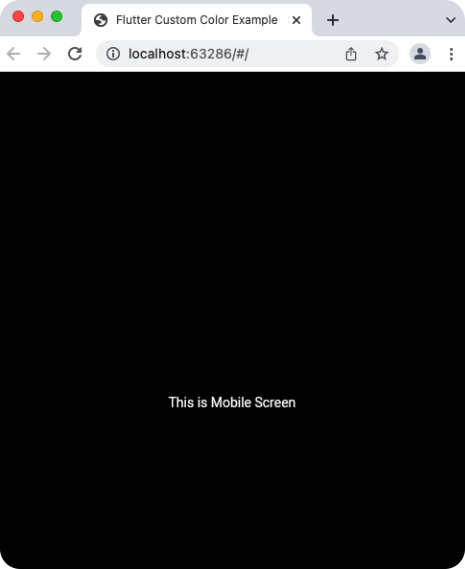
return Scaffold(
body: Center(
child: Text("This is Mobile Screen"),
),
);
}
}We use same stateless widget in both the widget. Make this simple for now by displaying a text on the screen as shown.
import 'package:flutter/material.dart';
class WebScreenLayout extends StatelessWidget {
const WebScreenLayout({Key? key}) : super(key: key);
@override
Widget build(BuildContext context) {
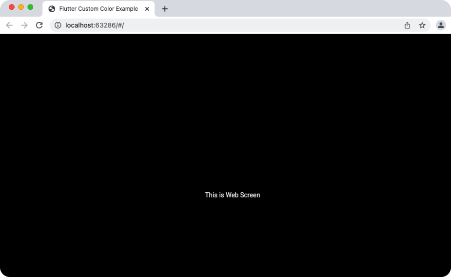
return Scaffold(
body: Center(
child: Text("This is Web Screen"),
),
);
}
}Now run the app in google Chrome and also in a mobile simulator. So we can test the app. For that run:
flutter run -d chromeIf you want to see it on iOS simulator then run:
open -a simulatorYou will notice it is working as expected. When we reduce the chrome screen size to 600 and below it changes to mobile view.