Category Archives: UI

6 Free Beautiful Color Gradients For Your Next Design Project

6-Free-Beautiful-Color-Gradients-For-Your-Next-Design-Project

Color is the most powerful design tool. It can evoke a mood, convey a message, or set a tone. Color is used to make people feel things and it’s important to understand how this works in order to use it effectively in your designs.

Gradient colors are a simple way to add depth and dimension to a design. They can be used as backgrounds, for borders, or to highlight important text.

You can use gradient colors in any kind of design: web design, print design, logo and branding design, illustration or photography. Here are some gradient color generate tools that you can use for your next project.
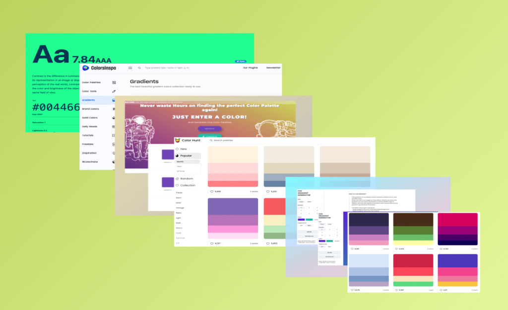
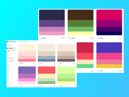
1. Color Hunt

Color Hunt is an open collection of beautiful color palettes, created by Gal Shir. It has various beautiful color combinations. The collection is open, and anyone can create and submit their own color combination. It provides you a Chrome extension.

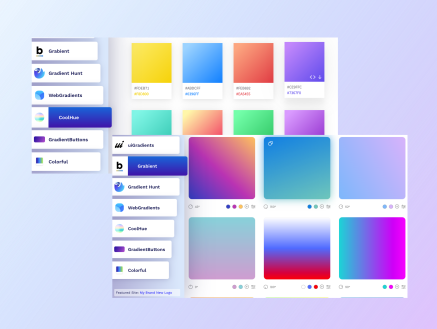
2. Gradient generator

This free web tool is created by Moe Amaya a product designer based in San Francisco  who creates resources for the design and development community. One of the best gradient color generator tool allows you to explore, try and choose from hundreds of beautiful blended color palettes. This is a free and open platform for color inspiration with thousands of trendy hand-made color gradients.
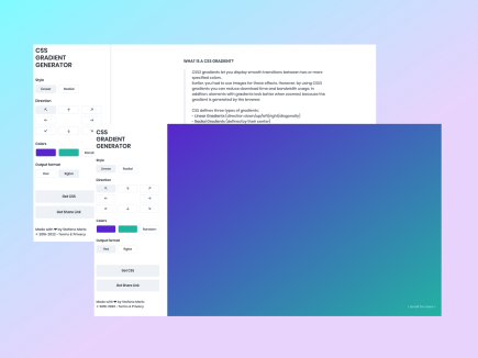
3. CSS-Gradient

CSS-gradient is a free css gradient generator tool, which helps you create a colorful gradient background for your website, blog, or social media profile. It displays smooth transitions between two or more specified colors. You can get CSS code for the color you generated on the website and directly use those code in your web programming applications.
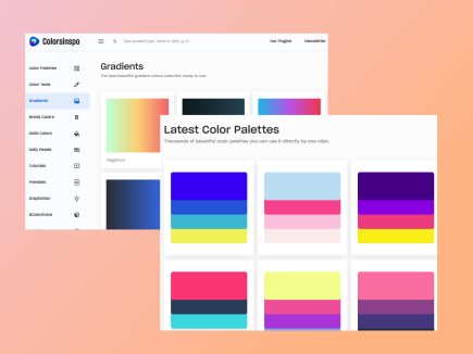
4. Colorsinspo

This tool is all in one resource for finding everything about colors with extreme ease. Also, you will get Freebies, Inspirations, Color Tools, Gradients and thousands of trendy hand-picked color palettes.
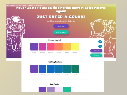
5. Mycolor

With this tool, you can find the perfect matching color scheme for your next project! Generate nice color palettes, color gradients and much more! You do not have to waste hours on finding the perfect color palette again. You just need to enter a color and generate nice color palettes using this tool.
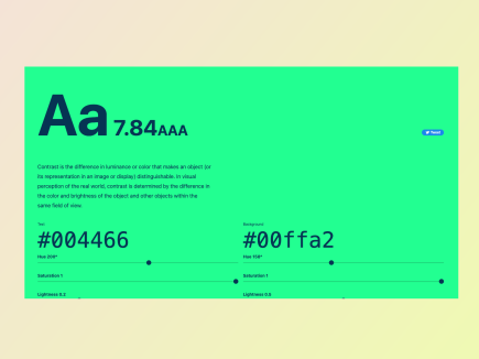
6. Colorable

You can choose a set color palette to produce contrast values for every possible combination with the help of Colorable. This is powerful tool for finding safe color combinations with predefined colors and includes pass/fail scores for the WCAG accessibility guidelines.

Thats all for now! Thanks for reading. If you have more tools, share more amazing websites.

Install Tailwind CSS with Next.js

Install Tailwind CSS with Next.js

Setting up Tailwind CSS in a Next.js v10+ project.

This tutorial will walk you through the steps by steps to install and configure a Next.js project with TailwindCSS.

TailwindCSS

Tailwind is a utility-first CSS framework that provides a set of ready-to-use mixins, so it doesn’t require any of the usual CSS configuration. TailwindCSS is used for frontend styling, as it helps build websites without ever leaving your HTML files.

NextJS

Next.js is a minimalistic open-source framework for server-rendered React applications, built on top of ReactJs, allowing developers to create JavaScript applications that work both in the browser and in Node environments (e.g., server rendering).

Create your project

Create a new Next.js project using command line tool. You can use NextJs official documentation to create brand new Nextjs app.

npx create-next-app my-project
cd my-project

Install Tailwind CSS

Install TailwindCSS and its peer dependencies via npm. You can also use yarn instead of npm. Now run the init command as shown below to generate tailwind.config.js and postcss.config.js. These files are helpful when you want to configure more things regarding TailwindCSS for your application.

npm install -D tailwindcss postcss autoprefixer
npx tailwindcss init -p

Configure your template paths

Add the paths to all of your template files in your tailwind.config.js file. You can use your own CSS, external packages and plugins in your project using tailwind.config.js.

module.exports = {
  content: [
    "./pages/**/*.{js,ts,jsx,tsx}",
    "./components/**/*.{js,ts,jsx,tsx}",
  ],
  theme: {
    extend: {},
  },
  plugins: [],
}

Add the Tailwind directives to your CSS

Add the @tailwind directives for each of Tailwind’s layers to your ./styles/globals.css file. Now basic setup is completed.

@tailwind base;
@tailwind components;
@tailwind utilities;

It is time to run your build process with npm run dev.

npm run dev

Start using Tailwind in your project

Start using Tailwind’s utility classes to style your content.

export default function Home() {
  return (
    <h1 className="text-3xl font-bold underline">
      Hello world!
    </h1>
  )
}

Create a Responsive Layout in Flutter

Create a Responsive Layout in Flutter

Flutter is a powerful choice for web and mobile apps development. In Flutter, we can create a fully responsive designs for several platforms using one code base. As we all know a responsive design ensures the appeal of our application is consistent and gives users a seamless experience, no matter the size of the device. For example, when the screen size of the browser extends to a certain width the layout of the app will be changed.

In this short article, we’ll be covering how to create responsive designs in Flutter for web and mobile devices.

Getting Started

To begin, we’ll simply use the app we created in previous tutorial that looks like something like this👇.

💡 For simplicity we are using fixed numbers for screen resolution but when designing user interfaces for mobile apps, always avoid hardcoding numbers for widget sizes and instead utilize percentages. The MediaQuery class in Flutter may be used to do this.

Let’s work on coding…

Make a folder named layout and inside that create new file called layout.dart. Create a stateless widget for now, later we can use a stateful widget when we fetch dynamic contact from backend. We want to return a widget named ResponsiveLayout which helps in creating responsive layout. LayoutBuilder will give us a builder function which then return to us a context and constraints. Using constraints we can get the screen width.

Now create a file named dimensions.dart in the utils folder. Our web screen size starts at 600 resolutions so we will display web layout when the screen size is at 600 and above.

Now we want to create webScreenLayout and mobileScreenLayout widgets and accept these two widgets using a constructor as shown.

class ResponsiveLayout extends StatelessWidget {
  final Widget webScreenLayout;
  final Widget mobileScreenLayout;
  const ResponsiveLayout(
      {Key? key,
      required this.webScreenLayout,
      required this.mobileScreenLayout})
      : super(key: key);

We have accepted those two widgets via a constructor and we want to return those two widgets.

import 'package:flutter/material.dart';
import 'package:flutter_gradient_example/utils/dimensions.dart';

class ResponsiveLayout extends StatelessWidget {
  final Widget webScreenLayout;
  final Widget mobileScreenLayout;
  const ResponsiveLayout(
      {Key? key,
      required this.webScreenLayout,
      required this.mobileScreenLayout})
      : super(key: key);

  @override
  Widget build(BuildContext context) {
    return LayoutBuilder(
      builder: (context, constraints) {
        if (constraints.maxWidth > webScreenSize) {
          return webScreenLayout;
        }
        return mobileScreenLayout;
      },
    );
  }
}

Now go to main.dart file and replace Center widget with ResponsiveLayout. We then import layout.dart file top of the main.dart file. Then pass both mobileScreenLayout and webScreenLayout as shown below.

It is time to create mobile_screen_layout.dart and web_screen_layout.dart file, so we can use these two widget on main.dart.

import 'package:flutter/material.dart';

class MobileScreenLayout extends StatelessWidget {
  const MobileScreenLayout({Key? key}) : super(key: key);

  @override
  Widget build(BuildContext context) {
    return Scaffold(
      body: Center(
        child: Text("This is Mobile Screen"),
      ),
    );
  }
}

We use same stateless widget in both the widget. Make this simple for now by displaying a text on the screen as shown.

import 'package:flutter/material.dart';

class WebScreenLayout extends StatelessWidget {
  const WebScreenLayout({Key? key}) : super(key: key);

  @override
  Widget build(BuildContext context) {
    return Scaffold(
      body: Center(
        child: Text("This is Web Screen"),
      ),
    );
  }
}

Now run the app in google Chrome and also in a mobile simulator. So we can test the app. For that run:

flutter run -d chrome

If you want to see it on iOS simulator then run:

open -a simulator

You will notice it is working as expected. When we reduce the chrome screen size to 600 and below it changes to mobile view.

How To Add Your Own Color to a Flutter App

How To Add Your Own Color to Flutter App

Introduction

Learning Flutter is a great idea. Flutter is great if you want to build a career in mobile app development. I’ve planned to write short series based articles on the things I learned about flutter.

In this article, you will explore how to change the overall look across your apps with Flutter themes.


Step 1 — Setting Up the Project

To create a new flutter application simply run the following command. Oh do not forget to complete the installation process of flutter SDK, its prerequisites and the environment setup.


flutter create flutter_custom_theme_example

Flutter create command will give us a demo application that will display a simple clickable button which increment the numbers as we click the button. Now navigate to the new project directory that we just have created.


cd flutter_custom_theme_example

We need to see how our code looks like on the simulators. For that simply run the following code below. We want to enable hot reloading so it reflects the changes as we make to our code.

open -a simulator

Now that you have a working boilerplate Flutter application. It is the time to add customization to the app.


Step 2 — Customize Global Themes

Create a new folder named utils inside lib folder. Create a new file colors.dart inside utils.


import 'package:flutter/material.dart';

const mobileBackgroundColor = Color.fromRGBO(0, 0, 0, 1);
const mobileSearchColor = Color.fromRGBO(38, 38, 38, 1);
const blueColor = Color.fromRGBO(0, 149, 246, 1);
const primaryColor = Colors.white;
const secondaryColor = Colors.grey;

Now we have created a color style globally for our application which can be used anywhere in our app. Open main.dart file and remove all the code given by flutter by default.

We want add dark theme to our app, therefore add dark theme using themeData given by flutter. Next add Scaffold widget to the main.dart file. Now we can see it has changed to default dark color provided by flutter team.


import 'package:flutter/material.dart';

void main() {
  runApp(MyApp());
}

class MyApp extends StatelessWidget {
  // This widget is the root of your application.
  @override
  Widget build(BuildContext context) {
    return MaterialApp(
      debugShowCheckedModeBanner: false,
      title: 'Flutter Custom Color Example',
      theme: ThemeData.dark(),
      home: Scaffold(body: Text('Flutter custom color example')),
    );
  }
}

We want a different colors, so this is the point we want to use colors.dart file created earlier so that we can use our own dark theme colors. Import colors.dart file inside our main.dart file. Then add our custom color to themeData shown below code.


import 'package:flutter/material.dart';
import 'package:flutter_custom_theme_example/colors.dart';

void main() {
  runApp(MyApp());
}

class MyApp extends StatelessWidget {
  // This widget is the root of your application.
  @override
  Widget build(BuildContext context) {
    return MaterialApp(
      debugShowCheckedModeBanner: false,
      title: 'Flutter Custom Color Example',
      theme: ThemeData.dark().copyWith(
          scaffoldBackgroundColor: mobileBackgroundColor,
          primaryColor: secondaryColor),
      home: Scaffold(
        appBar: AppBar(
          title: const Text('Flutter custom color example'),
        ),
        body: Center(
            child: Text(
          'Flutter custom color example',
        )),
      ),
    );
  }
}


Thats it! Now we have added our own custom colors to the flutter app. Yes this is very basic styling however in future tutorial we can add more styles and colors to flutter apps. You can find full code in this Github repo.

How to Create a Gradient AppBar in Flutter

How to Create a Gradient AppBar in Flutter

The gradient color trend is extremely versatile.


Introduction

If you want to feel a different and modern look in your apps then the go for choice is gradient color. The blend of different shades of color, gradient creates a completely unique feelings to the modern designs. Companies such as ,Hulu, Spotify, Airbnb and Laracast often use gradient colors in their products.


This article will teach you how to add and customize these gradient designs into your Flutter app. There are plugins for this to achieve, however we want to implement same exact feature without using any third-party plugins.

So lets begin…


Step 1 — Setting Up the Project

To create a new flutter application simply run the following command. Please make sure to complete the Prerequisites for any flutter project if you are running this command for the first time.


flutter create flutter_gradient_example

Navigate to the project directory you just created:

cd flutter_gradient_example

Step 2 — Using LinearGradient

Open main.dart with your code editor and modify the boilerplate code provide by flutter team. We write most of the our code on this file. We are using simple statelessWidget since there is not state management that we need to take care of.


class MyApp extends StatelessWidget {
  const MyApp({Key? key}) : super(key: key);
  @override
  Widget build(BuildContext context) {
    return const MaterialApp(
        // Remove the debug banner
        debugShowCheckedModeBanner: false,
        title: 'Gradient AppBar',
        home: HomePage());
  }
}

In the code below, you will notice we have used Scaffold and AppBar widgets. With these two widgets we are able to create an AppBar on top of our app.

Now use flexibleSpace property, so we can use a Container widget for a gradient layout. There are various kind of gradient but in this case we will use linear gradient method. It is also possible to have additional colors but in this example we are using only red and orange color.


class HomePage extends StatelessWidget {
  const HomePage({Key? key}) : super(key: key);
  @override
  Widget build(BuildContext context) {
    return Scaffold(
      // implement the app bar
      appBar: AppBar(
        title: const Text('Gradient AppBar'),
        flexibleSpace: Container(
          decoration: const BoxDecoration(
            gradient: LinearGradient(
                begin: Alignment.centerLeft,
                end: Alignment.centerRight,
                colors: [Colors.red, Colors.orange]),
          ),
        ),
      ),
    );
  }
} 

Step 2 — Run the emulator

Compile your code and have it run in an emulator. You will see gradient AppBar on your app.


Thats it. Now you have achieved gradient AppBar in your flutter app. You can find full code in this Github repo.

How to Navigate Between Pages Using Next JS Links

How to Navigate Between Pages Using Next JS Links

Introduction


One of the very first reasons to get up early when you’re beachside is to see beautiful sunrise. Today I spent time on beach area aiming to complete this article I started last night. This is a short article where I wrote about Next.js navigation and its implementation. So without further ado let’s jump into the topic.

Websites and web applications generally have more than one pages. But you may wondering, how to achieve routing in Next.js so users able to navigate between the pages. In this article, we’ll explore how to navigate between the pages but before that, first let’s look into the brief introduction of Next.js.


What is Next.js ?


In our previous article we have discussed about Next.js and its cool features in more in-depth. Next.js is an open-source development framework built on top of React.js. It is React based framework having various functionalities to power up both server-side rendering and generating client side static websites.

Next.js gives you amazing developer experience with all the features it provides for any production ready application. Features such as hybrid static & server rendering, TypeScript support, smart bundling, route pre-fetching give developers a seamless development experience.

Now, let’s explore how to add more pages to our application and how to manage page routing in Next.js.


In this article, we will learn:

  • Setup project in Next.js
  • Create pages
  • Use Link component to enable client-side navigation between pages.

1. Setup project in Next.js

We start with initial setup of the Next.js project. If this is the first time you are trying to create a project in Next.js then refer Nextjs official website where you get an extensive knowledge on Nextjs and its core functionalities.

To create a new app simply write the following command create-next-app, which sets up everything automatically for you. To create a project, run:


npx create-next-app@latest
# or
yarn create next-app

After installation is completed:

  • Run npm run dev or yarn dev to start the development server on http://localhost:3000
  • Visit http://localhost:3000 on your browser to view your application

2. Create pages

In Next.js, usually we create separate folder directory called pages. This folder consists of all the pages for the application. Pages are associated with the routes based on their file name. For example:

  • pages/index.js is associated with the / route.

const Index = () => <h1>Home page!</h1>
export default Index;

  • pages/about.js is associated with the /about.js route.

export default function About() {
  return <h1>About</h1>
}

3. Link component

Now we use next/link to enable the redirection between pages. To link different pages, we use <a> HTML tag. Next.js uses Link Component from next/link to wrap the <a> tag. <Link> allows you to do client-side navigation to a different page in the application.


To use Nextjs <Link>

First, open pages/index.js, and import the Link component from next/link by adding this line at the top:


import Link from 'next/link'


export default function Home() {

return (

<div className="lg:inline-flex lg:flex-row lg:ml-auto lg:w-auto w-full 
          lg:items-center items-start  flex flex-col lg:h-auto mr-12">
    <Link href="/">
      <a className="navtext uppercase">Home</a>
    </Link>
    <Link href="/about">
      <a className="navtext uppercase">About</a>
    </Link>
    <Link href="/contact">
      <a className="navtext uppercase"> Contact</a>
    </Link>
</div>

  );
}

In this example we create about us page only for simplicity. Therefore, open pages/about.js  and start writing content. You can add rest of the pages later.


function about() {
  return (
    <div className="container mx-auto px-4 sm:px-12 py-12">
      <h1 className="text-xl font-medium">About</h1>
      <p className="text-md font-base py-12">
        is simply dummy text of the printing and typesetting industry. Lorem
        Ipsum has been the industry's standard dummy text ever since the 1500s,
        when an unknown printer took a galley of type and scrambled it to make a
        type specimen book. It has survived not only five centuries, but also
        the leap into electronic typesetting, remaining essentially unchanged.
        It was popularised in the 1960s with the release of Letraset sheets
        containing Lorem Ipsum passages, and more recently with desktop
        publishing software like Aldus PageMaker including versions of Lorem
        Ipsum.
      </p>
    </div>
  );
}

export default about;

Wrap Up

In this tutorial we learnt how to use Next.js link to navigate between different pages on the websites. Next.js comes with so many great features including Client-Side Navigation and Dynamic Navigation but in this example we have used client-side navigation using Link tag. Now linking pages in any Next.js website is easier than ever, Huge thanks to the Next.js team.

Demo


Full Code

You can get full code from my GitHub repository. Also this demo is deployed in Vercel. Have a look!

Add Tailwind CSS to Existing React JS Project

Sandbanks are everywhere here in Maldives. Today, I went to a sandbank called Vagaath gale hutta (I believe that is the correct location), which is roughly 5 miles north west of Dhevvadhoo. During the trip I took time to write this tutorial.

So without further ado let’s begin…

Front-end technologies are constantly evolving. Some technologies are becoming incredibly popular among the developers while others get less attraction. When it comes to front-end development, now React JS has become number one choice for most of the developers.

When it comes to CSS frameworks, TailwindCSS started to get more stars on Github meaning developers love to use TailwindCSS over other CSS technologies.


React JS


React JS is a JavaScript library developed by Facebook. React JS is efficient, declarative and flexible open-source JavaScript library which lets developers to build scalable frontend web applications much faster and easier. It offers tons of benefits. Compare to other front-end frameworks, React JS is easy to learn, SEO-friendly, helps to build rich user interfaces, able to write custom components and much more.


TailwindCSS


TailwindCSS is utility-based low level CSS framework intended to ease building web applications much faster and efficiently. TailwindCSS helps to build websites without ever leaving your HTML files.

In this tutorial, you will learn how to add tailwindCSS to an existing React JS application. So without further ado let’s create a react app by running the following command.


npx create-react-app react-tailwind
cd react-tailwind

Go to directory of your my-app and run the following command.


npm i tailwindcss postcss-cli autoprefixer -D

Enter the following command to create the default configuration. This will create a tailwind.js file in the current directory.


npx tailwind init tailwind.js --full

Now, we need to create postcss.config.js file. For that simply run the command below. PostCSS is a tool for transforming styles with JS plugins.


touch postcss.config.js

const tailwindcss = require('tailwindcss');
module.exports = {
    plugins: [
        tailwindcss('./tailwind.js'),
        require('autoprefixer')
    ],
};

Create an assets directory in the src folder.


mkdir ./src/assets

Then create a file called tailwind.css in ./src/assets.


touch ./src/assets/tailwind.css

Now open tailwind.css and then import the following tailwind files as shown.


@import "tailwindcss/base";

@import "tailwindcss/components";

@import "tailwindcss/utilities";

Now it is time to modify package.json file just little bit. Simply add the following lines in the scripts tags.


"scripts": {
    "start": "yarn watch:css && react-scripts start",
    "build": "yarn build:css && react-scripts build",
    "test": "react-scripts test",
    "eject": "react-scripts eject",
    "build:css": "postcss src/assets/tailwind.css -o src/assets/main.css",
    "watch:css": "postcss src/assets/tailwind.css -o src/assets/main.css"
  },

Lastly import the file ./src/assets/main.css in the App.js file (or the root file of the application).


import React from "react";
import ReactDOM from "react-dom";
import './assets/main.css';
ReactDOM.render(<App />, document.getElementById("root"));

Now run the development server. Simply run:

npm start

Thats all! Now you can able to use Tailwind classes in your React JS application.

Code: Github